WEEK 46: Let’s Talk About Print

We have some amazing (and long overdue) news to share – we are now the official agency for Indya! For those of you who don’t know, Indya is a fashion brand that is modernising Indian wear, making it relevant for the globally aware woman of today – and doing a great job, if I say so myself. I already know many people who are loyalists of the brand, even though they have not yet gone out with any major brand campaigns. This, in fact, is what we will be working on together. Later this year Indya will be releasing its first large-scale brand campaign, and Humour Me will be conceptualising and executing it.


One medium we will be exploring in this campaign is print. While we typically don’t recommend using traditional mediums of advertising (on account of how they are very expensive and you cannot gain measurable results from them in terms of audience sentiment), that does not mean we will never use conventional mediums. To us, it ‘s not about the medium you use – rather, how you use it. At the end of the day it’s about whether or not you can capture your audience’s attention in a way that excites them, as opposed to being an intrusion and making them feel like you are interrupting them. 


When it comes to mediums that require larger spends, I have noticed that marketers often become very anxious about making sure that their audience clearly understands who they are and what their product is. I can empathise, for when you spend so much time and resources on a campaign, it is natural to want to do everything you can to make sure it is a success.


But what counts as a success?  


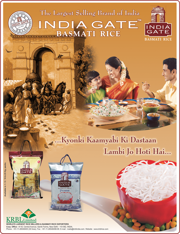
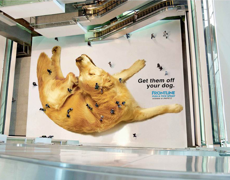
Take this print ad, for example:

This ad for India Gate’s Basmati Rice checks all the marketing boxes:


  • The brand name is boldly highlighted
  • The brand name is further emphasised through the image on the top left corner
  • Their demogaphic is depicted through the image in the top right corner
  • Their tagline takes the central position in the ad
  • Their product is highlighted in the bottom right corner
  • Their product packaging is clearly visible in the bottom left corner


But what do you as a consumer see? You do not think like a marketer; you simply see the overall image. And to be honest, this image seems cluttered, with no clear message coming through. If I were to see something like this – and I do, very frequently in fact – I would simply register it as the visual equivalent of white noise and dismiss it.


Some brands take a different route – they know that their audience is unlikely to stop and look at a print ad, so they attempt to hijack attention with a famous face.


Take this Colgate ad, for example:

Colgate went down the brand ambassador route and expected us as consumers to pay more attention to their brand because Sonam Kapoor is associated with it. But I would give us consumers a bit more credit – our IQs are not that low. No one really believes that Sonam Kapoor uses this toothpaste. The message on the print ad is extremely transactional, and not at all thought provoking.


I sense that brands who make ads like this are probably aware on a deeper level of how consumers really feel. This must be why they spend so much money on making sure their ads are as visible as possible, so that they can measure success in terms of how many people saw their ad. But that may not be the best way to make a print campaign succeed. If I do not like your ad, then seeing it everywhere will not change my mind – in fact, it could make me dislike your brand even more. The experience is rather like having an irritating person follow you everywhere constantly yelling, “Look at me! Look at me! Look at me!


The truth is that print ads have so much potential, once brands stop looking at them as blank spaces on which they need to stuff as much information as possible about themselves in order to make a sale. Here are some of my favourite print ads from other parts of the world, starting with a Colgate ad for dental floss:


This ad sends me a crystal clear message without having to say anything at all. It is very cleverly done and actually made me chuckle (which means it effectively captured my attention in a positive way). Even if I saw this ad just once, I would not forget it in a hurry. And the fact that is it so unique made me want to know which brand was responsible – which meant that I took that extra effort to look at the bottom right corner to see Colgate’s name.


I had a similar reaction to this print ad. Once again, the message is clearly portrayed in a creative way. Volkswagen didn’t worry about the fact that their product is not front and centre, or that their brand name and logo weren’t big enough, or that the copy was too inconspicuous, or that audiences might not understand the concept (on another note, being constantly told to ‘idiot proof’ ideas is one of the most frustrating things about working in advertising)


One can argue that Volkswagen and Colgate are very well known and therefore are in a position to experiment more with their print ads. I disagree. If I had never heard of a brand before, a clever print ad would in fact make me want to Google who they are (as opposed to a transactional ad that shoves the brand in my face). And the fact that I took that step to learn about a brand means that they have already captured my attention. Marketers are often afraid of their brand getting missed, and therefore choose a more transactional route for their print campaigns. But which is better – taking a chance on a clever creative and gaining a thousand loyal followers, or making a transactional ad that contains everything about your product on it, but interests no one?

Even if a brand wants to make their product more obvious, that doesn’t mean that creativity must be sacrificed. Take a look at this ad:

This ad showcases the product in a very clear way (pun intended). And yet, it is still highly imaginative and entertaining.


Here’s another ad that showcased both the product and its USP without having to say a word. Not only was the idea imaginative, but it was also very creatively executed (the illustrative treatment style drives the point home much stronger than a live action shoot would have done)


Now for an interesting marketing challenge: how do you create a print ad to encourage people to explore the information a museum has to offer? Here’s what Russia did:

I love how this creative instantly catches your eye. This ad is not only a visual treat that I could spend hours looking at, but also perfectly captures what the museum was trying to say. Moreover, the copy (discover the full story) really cements the message, instead of confusing it or cluttering the visual.


The last ad I will show you in this entry is my favourite of the lot, because it actually involved people in real time:

Frontline put its print ad on the floor of a mall, so that when seen from above, people walking across the floor looked like fleas on the dog. Brilliant!


Indian print advertising has so much scope for creativity, which is what we are trying to bring with our upcoming campaign for Indya. We want to create something that not only catches your eye, but also makes you think, and want to learn more about the brand. And when the campaign goes live, let me know if we achieved the desired effect.


See you next week!

    Leave Your Comment Here